Company: Deloitte
Project: Design System
Metrics
- 45
atoms - 200
molecules - 40
templates - 130+
users
After conducting training sessions and leading weekly office hours to evangelize the design system, adoption and compliance increased significantly across teams.
The derivative result:
- 75% (4x) faster page design turnaround through systemized components and templates.
- 2.5× increase in design contributors (50 → 130+) while maintaining consistency and quality.
- 80% fewer digital producer turndowns
Description
Atomic Design System built with FIgma on top of Adobe Experience Manager (AEM) components and templates. The initiative focused on unifying the website’s design and development through a reusable AEM component library across a large number of geos.
The project involved:
- Auditing and standardizing existing AEM components to ensure consistency, accessibility, and alignment with brand guidelines.
- Designing styles, icons, atoms, molecules, and reusable UI patterns and templates that integrate seamlessly with AEM’s authoring model, empowering content authors to build pages with minimal developer intervention.
- Documenting design tokens, interaction guidelines, and component behaviors in a centralized repository for design and development teams.
- Collaborating across disciplines — including UX, development, and content strategy — to align on component structure, responsive behavior, and governance processes.
- Implementing a scalable architecture that supports theming, localization, and future component expansion.
- Accounting for automation to deliver faster human-error-free hand off using proprietary AI developments
- Conducting training sessions and workshops to onboard teams to the design system and promote adoption across global geographies.
The resulting system provides:
- Faster time to market through component reusability and AI automation
- A consistent user experience across all digital properties
- Streamlined collaboration between design, development, and content teams
- Improved maintainability and governance of AEM assets
My Hats
UI Design, Prototyping, Digital production
Building an Atomic Design System in Figma — AEM Integration
-
Background
This project focused on creating a unified atomic design system in Figma built on top of existing AEM components and templates. The goal was to bring visual and behavioral consistency across multiple digital experiences while ensuring that designs were feasible and maintainable within AEM’s constraints. The initiative also included mentoring and managing a team of six junior designers responsible for component pressure testing, template recreation, and documentation.
-
Requirements & Constraints
- Primary Objective: Build an atomic design system that maps to AEM components and templates while improving consistency and developer handoff.
- Tools: Figma (design, components, prototyping), AEM (authoring & validation), legacy Adobe XD files (reference).
- Deliverables: Styles, Icons, Atoms, Molecules libraries, and 6 Template Libraries mirroring AEM templates.
- Constraints: Incomplete/incorrect legacy XD files, inconsistent AEM component behaviors across templates, need for RTL support, and policy-driven configuration in AEM.
-
Data & Research (How the legacy files and AEM discovery influenced the system)
The starting point was a set of fragmented Adobe XD files that were often incomplete or inaccurate. To ensure fidelity with production, I conducted a thorough audit of AEM components directly in the authoring environment.
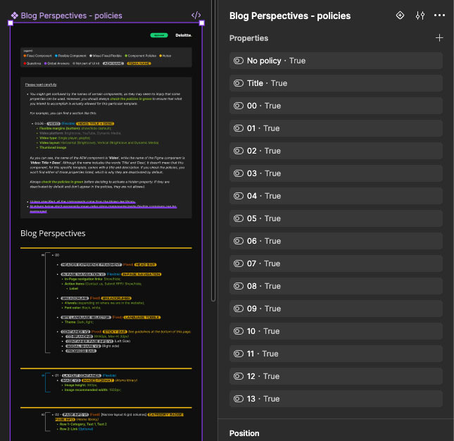
During the audit I compared component behavior across templates and documented discrepancies. This revealed that the same named component could exhibit different prop sets, markup, and responsive rules depending on the template — for example, image ratios or available text areas varied between a Homepage and a Product Detail Page.
Decision: Create local instances of molecules inside each Template Library to capture template-specific behavior, and surface AEM policies as required reading for designers. -
Team & Collaboration
I led a team of six junior designers. Responsibilities were split across three streams:
- Pressure Testing: Test components under edge cases, responsive breakpoints, and RTL rendering.
- Template Recreation: Rebuild AEM templates in Figma using verified component behavior.
- Documentation: Add interaction notes, policy links, and usage patterns for each component.
Mentorship included regular design reviews, pairing sessions within AEM to show real component behavior, and checkpoints to ensure the team understood policy constraints and design feasibility.
-
Library Architecture
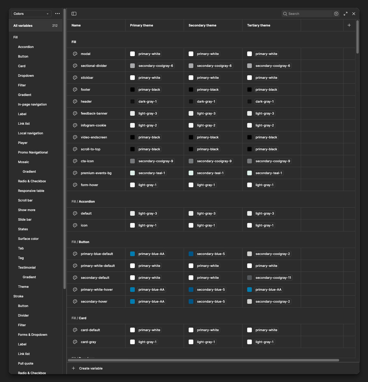
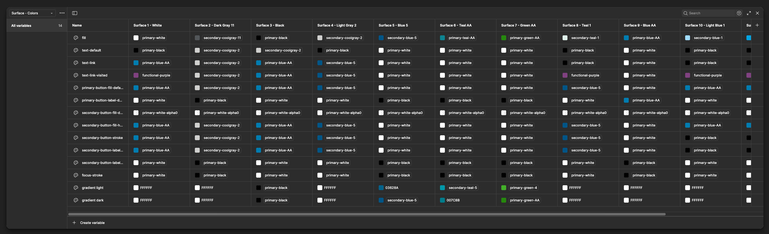
Styles LibraryThe Styles Library established a shared visual language across all other libraries:
- Color Tokens: Mapped directly to AEM design variables, with defined states for interactive elements.
- Typography: Set up with consistent naming conventions to match AEM’s CSS classes.
- Spacing & Grid: Based on an 8pt system with responsive considerations.
- Elevation, Radius, and Shadows: Aligned to brand standards, ensuring visual harmony across templates.
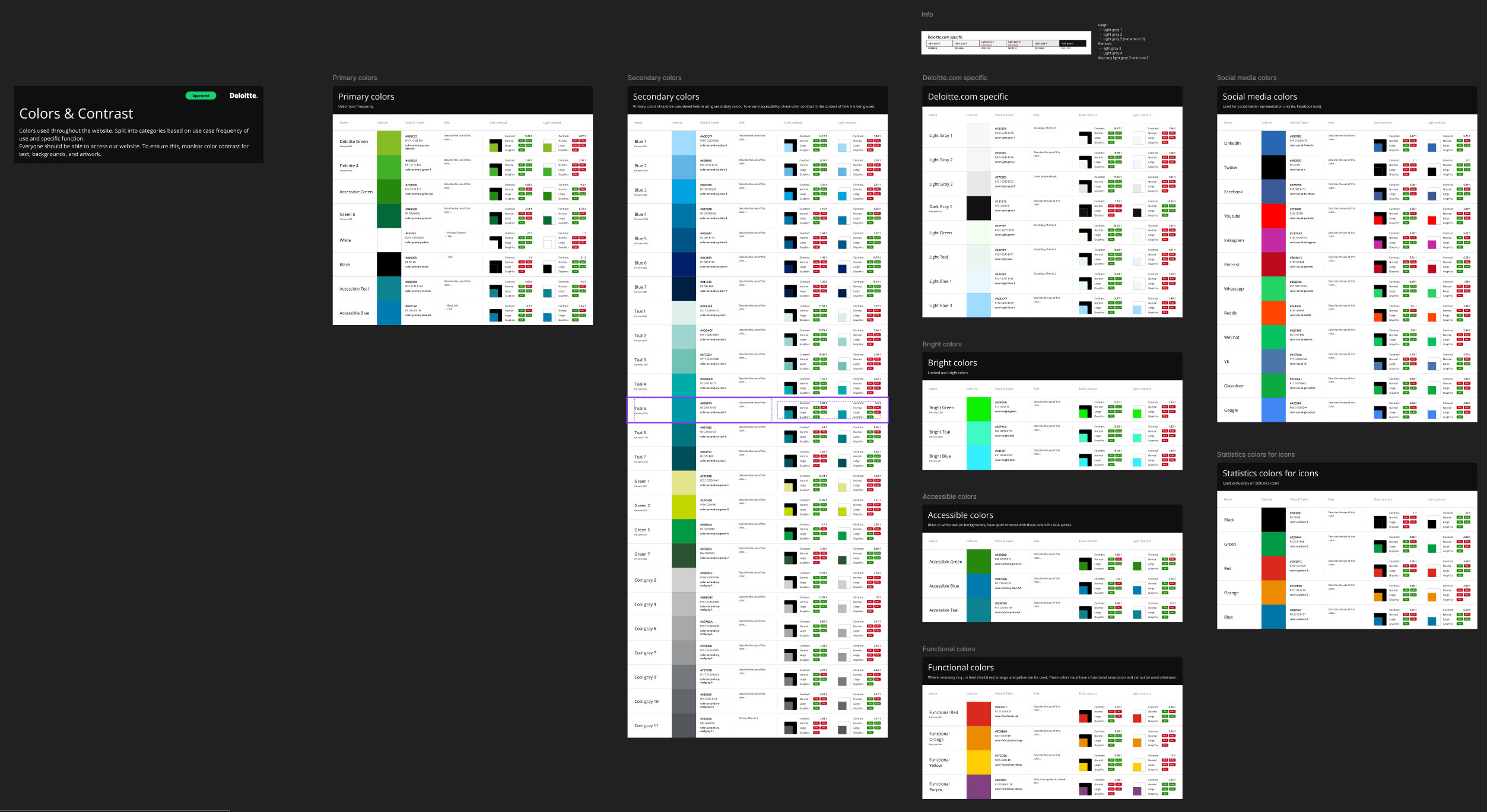
Additionally, this library made extensive use of Figma Variables to manage multi-theme and multi-mode design support:
- Color Modes: Used for background and surface colors.
- Typography & Spacing Tokens: Used variable collections to manage responsive adjustments and language-specific settings (e.g., increased line height for Arabic).
- Developer Parity: Variable naming conventions were synchronized with AEM’s configuration schema, accounting for straight-forward automation and allowing developers to easily map visual tokens to CSS.
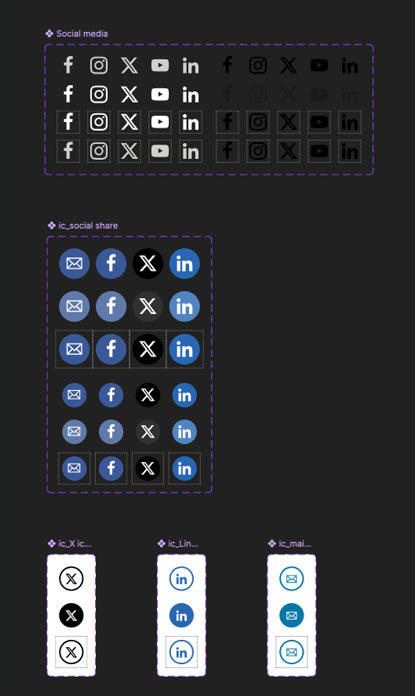
Icons Library
System icons implemented as Figma components with variants (size, state, RTL flips). Icons were optimized for legibility and aligned with accessible touch targets.
Atoms Library
Smallest building blocks: buttons, inputs, labels, helpers. Built with auto-layout and constraints so they scale predictably when nested inside molecules or templates. Each atom included metadata mapping to its AEM equivalent.
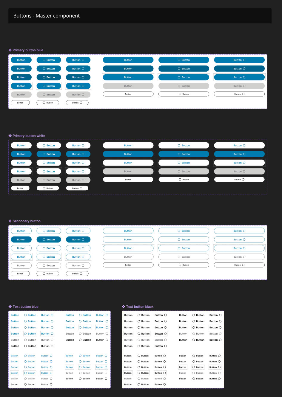
Molecules Library
Grouped atoms into functional components such as cards, banners, promo tiles, and navigation items. Each molecule had:
- Variants for content density and responsive behavior.
- RTL variants for geos that required it.
- Interaction notes describing how the component maps to AEM policy configuration and what is safe/unsafe to change.
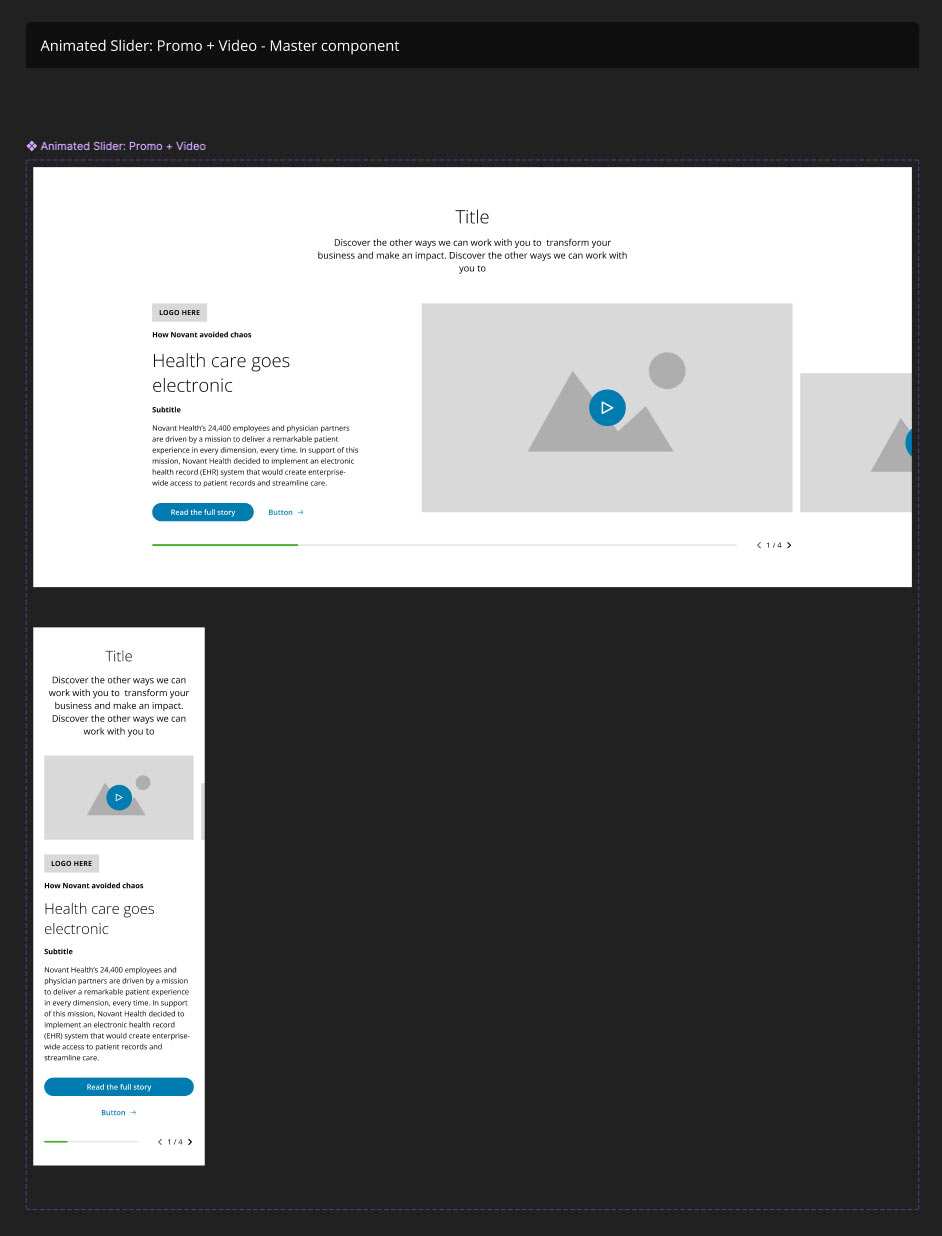
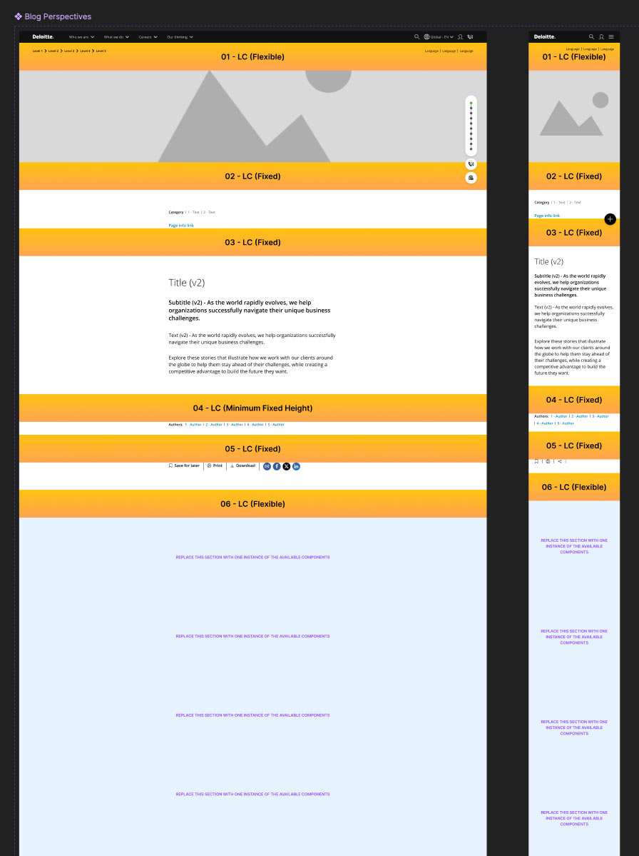
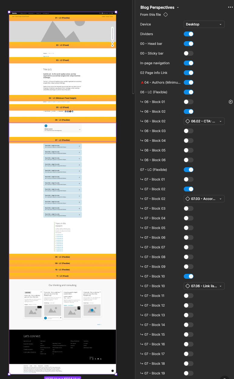
Template Libraries
The initial template library was split into 6 separate files to ensure performance and avoid memory usage issues.
Each library contains several templates order in alphabetical order. Each template responds to a business use case and they are built to account for the need to have more than one instance of the same component in one section, depending on specific policies.
In practice, the same molecule was frequently instantiated as a local component inside these template libraries to lock in template-specific behavior and ensure design artifacts aligned with AEM policies (for instance: image aspect ratios, editable text fields, allowed nested components).
-
Prototyping & Interaction
Components were prepared for prototyping with fidelity suitable for stakeholder demos and usability testing:
- Simple interactions: hovers, clicks, toggles, and basic overlays using Figma variants and Smart Animate.
- Complex interactions: local navigation (multi-level behavior), carousels with pagination & autoplay controls, and sticky headers that integrate with page scroll behavior.
-
Outcomes
- Delivered a fully documented and scalable design system integrated with AEM.
- Reduced design-to-development friction by establishing component parity between Figma and AEM.
- Empowered designers to work independently within a clear system of policies and templates.
- Mentored junior designers, improving their understanding of component-driven design and AEM integration.
- Established a foundation for ongoing governance and maintenance of the design system.
-
Key Learnings
- AEM variability requires designers to account for template-specific differences — policies are crucial.
- Verify legacy design files against the live CMS before building system assets.
- Mentorship and shared documentation scale a small team quickly when adopting component-driven design.
- AI needs a clear structure in terms of layers, in order to "understand" teh design and successfully translate it to AEM pages.
-
Next Steps & Recommendations
Ideas for maintaining and growing the system.
- Clean up layers by using semantic-oriented nomenclature and clear structure, for AI to success.
- Set up a cadence for policy reviews alongside AEM releases.
- Integrate tokens with a single source of truth (design tokens pipeline) for automatic sync with AEM variables.
- Continue building advanced prototypes for complex molecules to aid development estimation and QA.