Company: CyberWarrior
Project: Web App
Description
Design of a web app intended to be the base of operations for students, also potential job applicants, and companies.
My Hats
UX Research, UX Design, UI Design
Process
-
Background
Necessity for a private site bridging the gap between the general audience website and the existing eLearning platform.
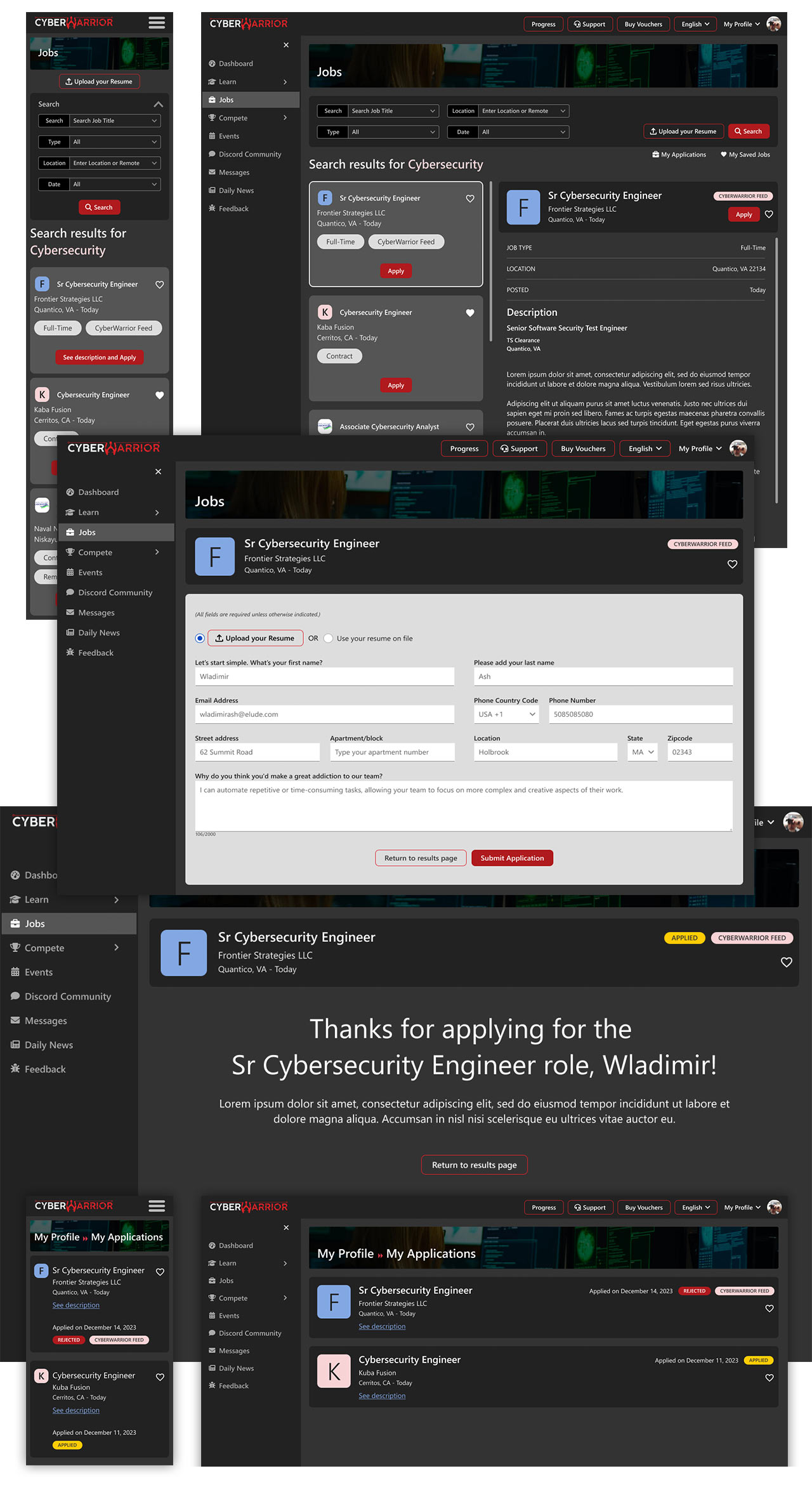
In addition to introducing a dashboard tailored for students, the site was improved with the notion of empowering them to seek job opportunities through the web application. The platform also incorporated supplementary features such as messaging functionalities and various learning tools, alongside the primary eLearning platform.
From the standpoint of corporate clients, there was also a demand for a dedicated space to explore talent customized to their specific technological needs, particularly in cybersecurity.
-
User Research
I conducted individual interviews with end users to gather feedback on the positive aspects of their overall experience and also identify areas requiring improvement. In preparation for that, I formulated a comprehensive UX research study plan encompassing various objectives. Among these, assessing the ease of sign-up and course navigation was important, followed by soliciting feedback on the overall functionality and aesthetic appeal of the platform.
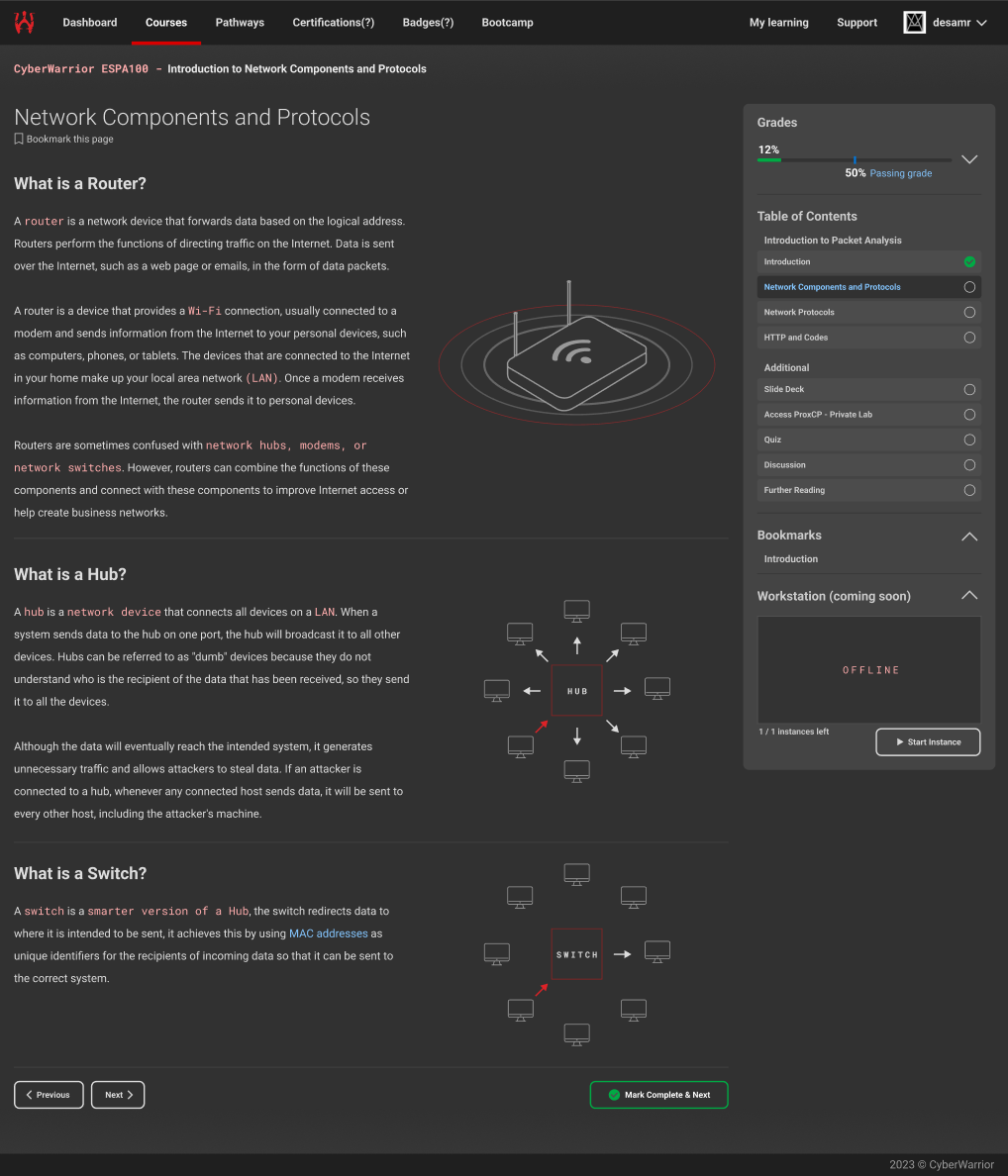
At the time, they were utilizing an eLearning platform built with EDX, but the dashboard it provided appeared somewhat rudimentary and static. Consequently, it became apparent that they required a more sophisticated starting point to have greater control over their learning pathways.
Along with that, they were very positive with the idea of having direct job opportunities from the academy, so I planned to include features covering this matter.
-
Definition and Ideation
I designed various user flows for the distinct roles, including both students and corporate clients, while considering specific functionalities unique to each. Additionally, I conceptualized the web application's architecture and delineated the optimal structure for the public website, ensuring smooth navigation and usability across all interfaces.


-
Sketching, Wireframing and Visual Design
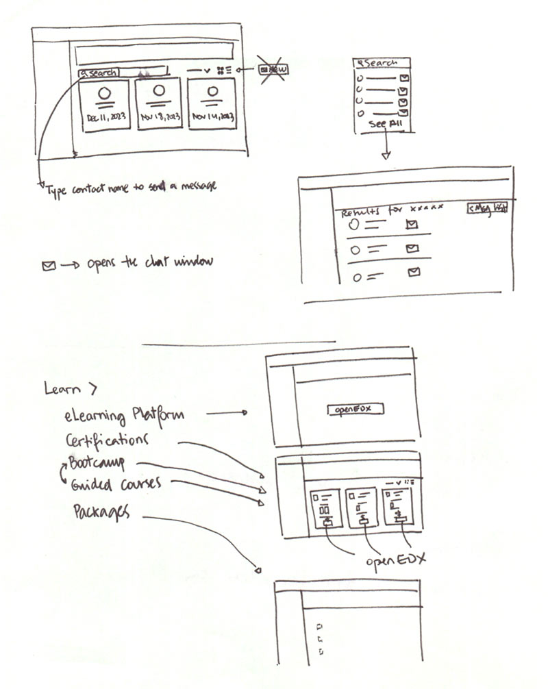
While certain sketches were drafted to be discussed in internal team meetings, specific wireframes were developed for both presentation to upper management and user testing, with the final visual design representing the culmination of this work, prepared for handoff to the development team.


-
What I learned
User research became crucial in identifying areas susceptible to becoming pain points. Insights gathered on color scheme preferences guided our approach to the new visual design, leading to a transition from a light to a dark theme.