Company: Ecubia
Project: inLog Warehouse Management - Mobile Application
Description
Digital transformation of an obsolete computer station system into a modernized architecture based on handheld devices to control all the operations within a logistics-company warehouse in Spain. I had the opportunity to work closely with the operators to see their needs and observe the different user cases directly. I even sketched some of the wireframes up on a crane next to the worker, looking at what they were doing. By the time I started working on the visual design, Google had introduced its design system, Material Design, and I used it as a base to build the layouts of this app. The company increased revenue by 5 to 10% annually until its shutdown during the COVID-19 pandemic.
My Hats
UX Research, UX Design, UI Design
Process
-
Background
My small design/development boutique was contacted by some fellow partners to collaborate on this project. We were a team of six people, one account manager, four developers, and one designer, who was me. InLog needed to modernize their process from A to Z, starting even with the logo, which I refreshed myself.
-
User Research
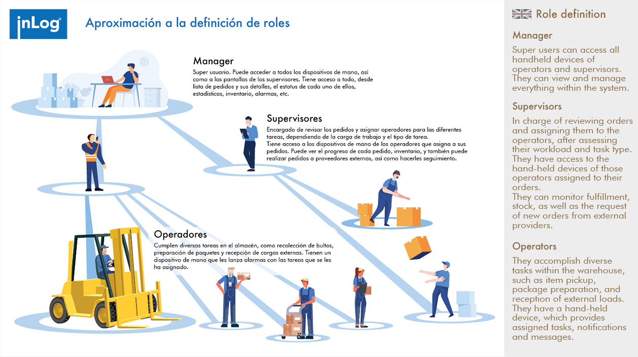
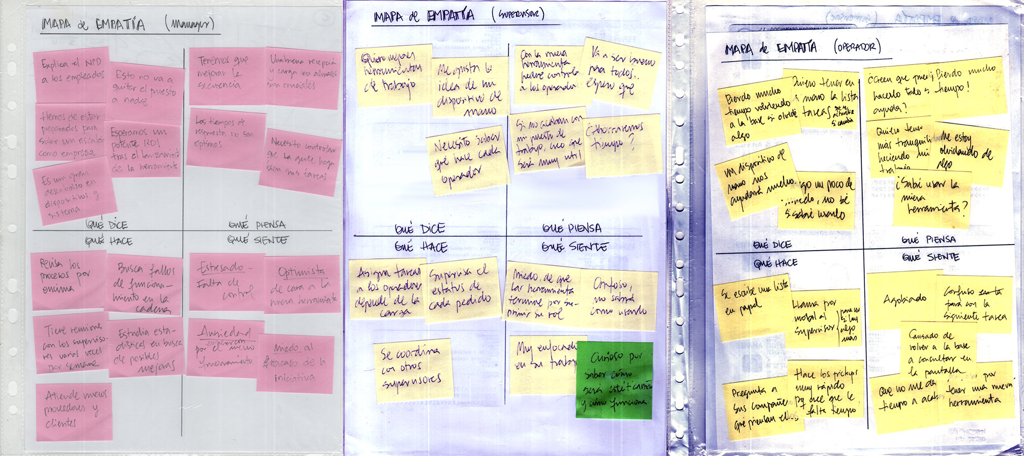
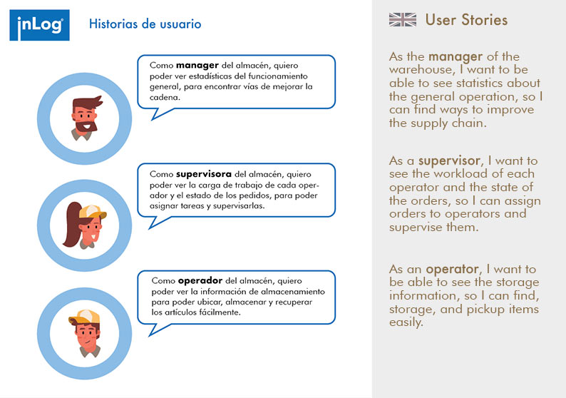
Constant contact with the actual/specific users of the tool was vital to success. Not only programmed interviews but daily conversations and observation sessions took place with several operators and supervisors. I utilized the insights from these sessions to create role definitions and empathy maps.
-
Definition and Ideation
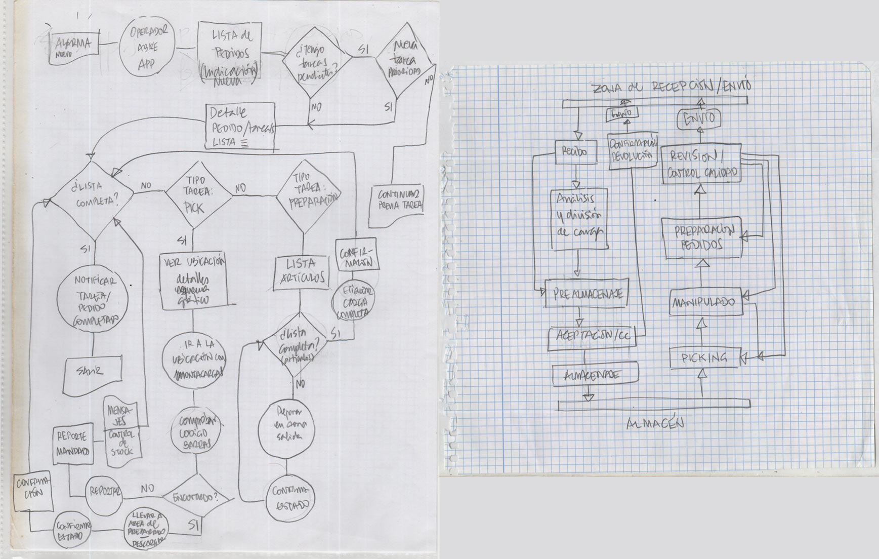
I crafted multiple user flows depending on the role, specific functions, and other flowcharts, trying to understand the process flows inherent to this warehouse.
-
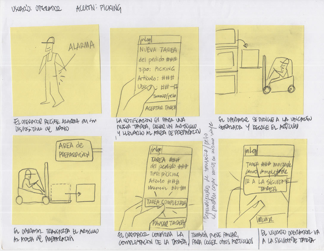
It was rare in this project, but I did some storyboarding at the beginning. Afterward, I learned that for this project in particular, it was easier and faster to draft wireframes directly, with the help of the users themselves.
-
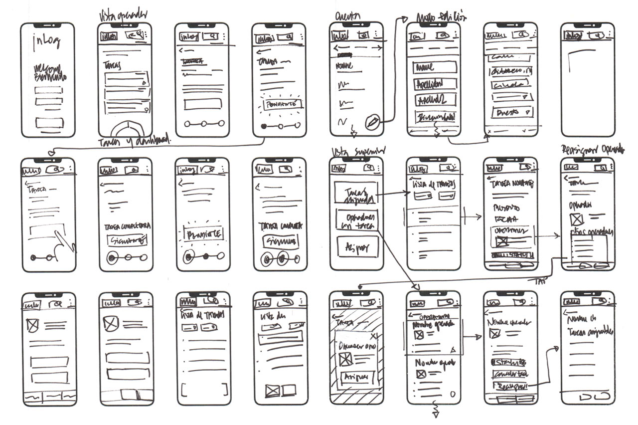
Engaging in swift sketching enabled me to delve into prevalent design patterns across the application, enabling me to discern which patterns should be incorporated into Inlog for a sense of familiarity. This approach also aided in pinpointing screen types with versatile potential and intuitive swiping/touch gestures.
-
Wireframing and Visual Design
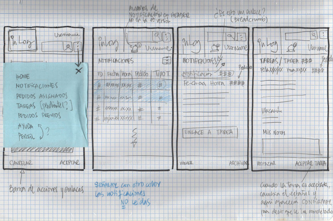
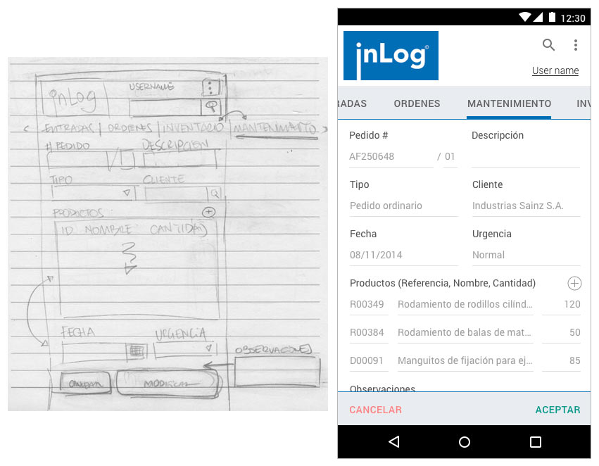
I wireframed the entire application, and these are just some examples of the work, along with the final visual design. At the very beginning, I was considering other types of look and feel. Then, it was when Google's Material Design launched at that precise time, and I took advantage of it by using it as the base for the tool's design and interactions.
-
What I learned
I approached the project with the initial assumption that it would involve a straightforward transition from the outdated system to a contemporary and visually appealing application. However, I swiftly realized that the legacy system was inadequate and innacurate in addressing all the necessary functions for both operators and supervisors.
Direct observation of a "typical day in the life of an operator" significantly streamlined my work compared to assuming behaviors from a biased standpoint.
Individuals reach the same destination through various routes and directions, necessitating consideration of these factors when designing.