Company: Wells Fargo
Project: FICO Triggers Data Visualization Tool
Description
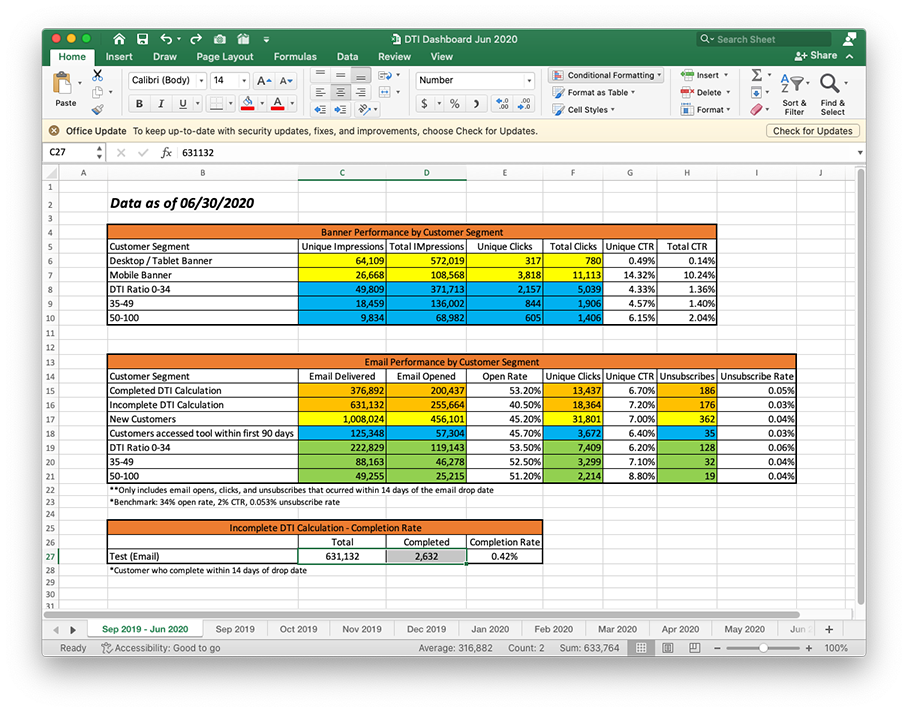
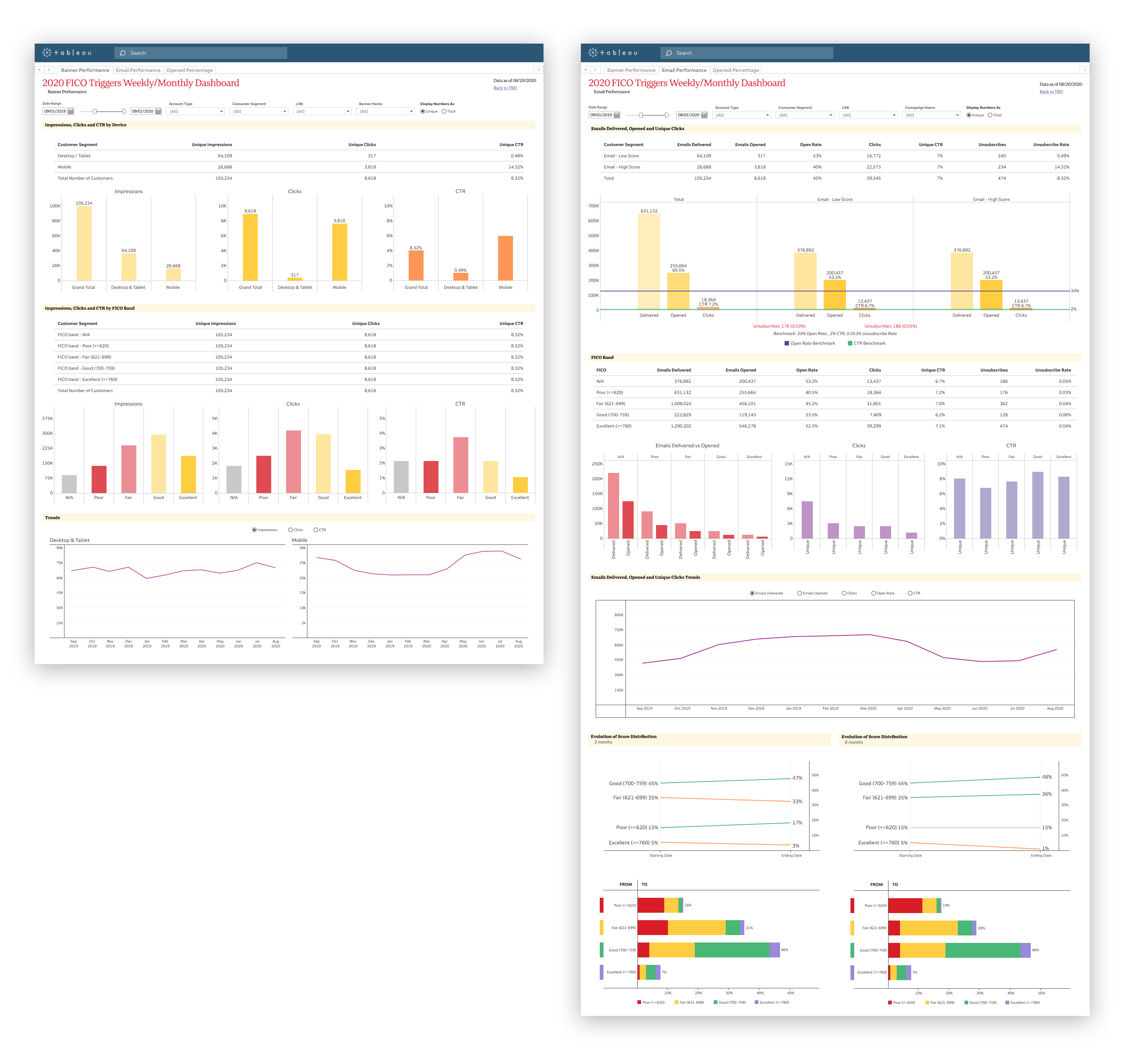
Tableau dashboard built for marketing analysts to measure the performance of a particular bannner and email campaign. The example below presents the number of emails delivered, opened, and those with unique clicks. Other metrics are shown too, like the FICO scores, and comparisons of the different FICO segments, along with some trends and evolutions.
My Hats
UX Research, Data Analysis, UX Design, UI Design/Data Visualization
Process
-
Background
There's a need to evaluate the performance of certain marketing campaigns.
The process to obtain the data and construct reports to be presented to senior management was totally manual and thus slow -taking days to put together a single report-, static and not error-free.
-
Requirements
- Automated FICO Campaign screening dashboard in Tableau
- Dashboard to be self-serve, so the business analysts can go in and filter data to create unique views
-
Filters
- Filter for channel (Banner vs Email)
- Filter for customer segment (Desktop vs Mobile)
- Filter for Account Type
- Filter to select date range
- Parameters for FICO ratio levels
-
Needed Information
- Monthly volumes and rates
- Complete/Incomplete
- FICO ratio levels
-
Data Provided
Some examples of data sets from previous campaigns in Excel format.
-
The Problem Statement
Our end user is a marketing specialist who needs to make fast decisions on current campaigns because they have to improve the performance (increase the CTR) before the campaigns end.
-
Work Sessions
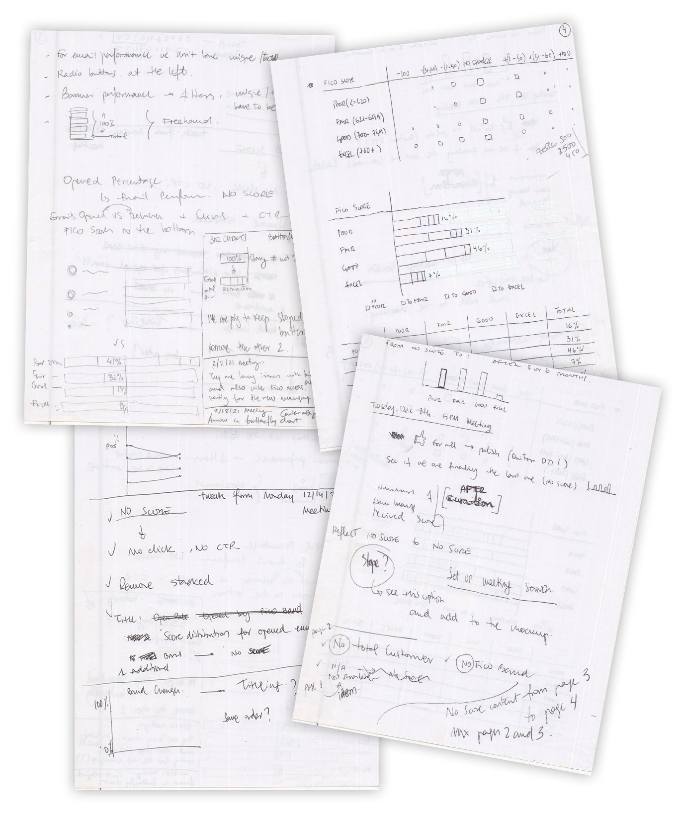
Meetings with stakeholders, data specialists and developers to come up with the best way to present the required data. On my end, the outcome of those meetings was a series of notes and sketches that helped me to design the layouts of these dashboard-based products.
-
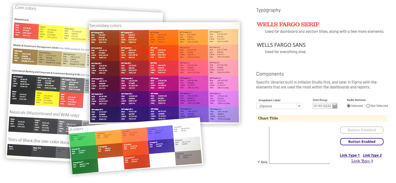
UI Style Guide
For the style guide, a mix between the main Wells Fargo brand guidelines and a specific set of ad hoc components were used to design this product along with many others.
-
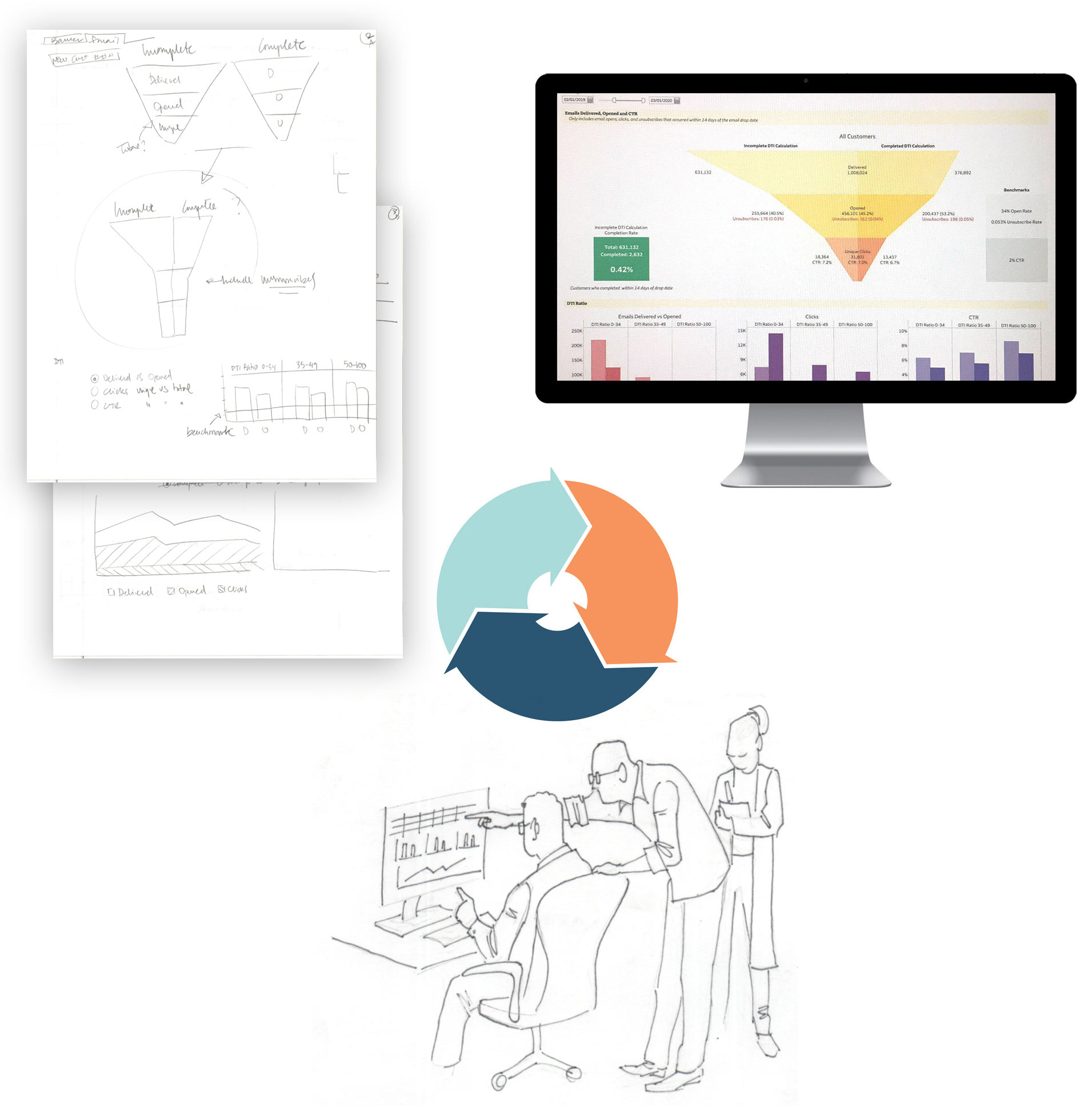
Prototyping and Testing
Taking the results of the ideation process, it's time for wireframing, exploring ways to visually tell the data story. Multiple iteration is essential to get to the closest-to-perfect solution for our end users.
-
Visual Design
These are some mockups resulting from the previous process. They will serve 2 purposes. First, to be presented to the stakeholders for final review. Then they will be handed off to become a visual reference for the development team.
-
What I learned
Iterating multiple times is essential; what may seem suitable in your initial perception often diverges significantly from reality, if not completely opposite.
In specific organizational contexts, determined by the level of UX maturity, there could be a need to engage with pixel-perfect mockups prematurely, as a means to test ideas directly with users.
Concerning data visualization, while various methods exist to portray data and convey narratives, a significant portion of users consistently favor interacting with two specific types of charts: bar/column charts and line graphs.